Showing posts with label acrylic. Show all posts

Thursday, July 17, 2014

Summer Break

While I am working hours I could have wished for in the Winter and not producing art I am still thinking about it. We found some fun stuff on a day trip:


A starry night fish in Elk Rapids at the marina with a view of the island house library and marina. Awesome! And then we found a sleeping bear pictoral downtown....


Wednesday, November 6, 2013

Amphora Star Tag

I am almost embarrassed to show a before and after. So I'll just post the after here.


And we will forgo the before shot today. I have to say though.... this is the first time that what is posted to Blogger is a different intensity than what I was working on. I thought that my colors were a little richer if on the somewhat darker side of the shades. Perhaps it is the difference between working with a dark background screen at night and a white background screen at night. I don't know.


Tuesday, November 5, 2013

Tutorial: Difference Mode

So there are a million things that you can do with the Picmonkey photo editor. But most likely I will just use it to do the same things that I always do. That is called personal style. I feel like a fake trying to do things "grungy", "gritty", "hip" because that is not me any more than trying to do things "goth" or "emo". I have a style and that is all there is too it. The trick is to figure out how to make your style show with the tools that you are given. And figuring out how picmonkey's tools work can be a fun adventure or a lesson in frustration. Just in case you are not into adventure I've made a tutorial to show you how to get the look that I did.

A word of caution though: this looks like a complicated tapestry with color splashed in a random, willy-nilly fashion. But the key to pulling this off is actually restraint. I've limited the palette of overlays to one color way (two shades of the same green) and I've only used texture templates that will keep the colors within a narrow bandwidth on the color wheel, keeping in mind that orange and blue are opposites. This is where the highest contrast should be. It keeps things interesting. If I were to throw in lots of bright opposites it would get confusing. So where there are elements to add depth I've kept close on the color wheel with neighbors (the blue violet and the teal green). It sounds confusing right now but as we go along it should be clear.

So first:


Upload your original work to picmonkey. I have a few flaws with the photography, primarily the hot spot in the top left corner. The first choices I make with be to diminish it's presence. Sadly though the crop feature, while most expedient would destroy one of the main elements. The photo is crooked so I will adjust that with the straighten tool in the rotate menu. Adjusting the exposure with the auto adjust isn't going to do a lot to make me happy with this either. So now I know that the textures menu is the key to fixing my poor photography. Onto step two.
The left side of your screen is where all the main menus are. Under each tab is a drop down menu to edit your specific choices. And this is where the fun begins. I didn't know that I wanted to go in this direction until I started playing with the various modes. Once I hit on Difference I knew that I would have to be a bit more explorative with the textures. You might make other choices based on the work you are editing. These are the choices I made.
 
Step 2
  • TEXTURE> EDIFICE: select water mark set mode: difference set saturation 38% set fade 20%. This flips the temperature of the painting to its opposite on the color wheel. Cool spots are now warm. Warm spots are now cool.
  • TEXTURE> SMUDGE> PAPYRUS set mode: multiply set saturation 120% set fade 16%. The three choices that lead in the direction I wanted to go were Papyrus, green marble, or the red milk paint. I chose PAPYRUS. In this application I got a tartan weave that I wanted to preserve. And it expanded my palette by turning some blues to a teal green and some of the reds to violet. An added benefit is that the top part of the lekythos took on a batik feel and some of the details faded a bit. 
Step 3
  • THEMES> WITCHES> ANTIQUATE> DAMASK set mode to lighten, set saturation to 154% set fade to 0%. Then use the erase tool (look for the brush button on the drop down menu when you first  open the ANTIQUATED menu. Erase parts with the softer setting of the large brush to retain details in the lekythos. You want the damask pattern to sit in the background and draw only a little attention while adding in some background texture that was lost when the original flipped in step two.
Now save. SAVE SAVE SAVE! This is key. At this point if you don't save you won't be able to fix any future mistakes easily. And it will be easy to make mistakes with the next step. The next step mimics the process of masking and over stamping. We are going to bring in a few of the details from the original.


Step 4: Overlay the original. Open the Texture menu. In a nondescript button right at the top is a button that says "YOUR OWN". Click and open the original. It will appear on your screen in a teeny tiny version. Grab the corner and pull until it is the same size as the one you are working with.
  • Fade this to 80% to place it over the same spot. This will be a bit tricky if you had to straighten the original as this one won't be able to be straightened. Once placed, fade to 49% to work with the eraser.
  • Select a soft brush setting and use a large brush. Keep the jar and flower intact. Erase everything else to let the background you just created come through.
  • Shrink the brush setting on your eraser and go into the center of the flower to bring the background through there as well. Use the soft setting so that the petal edges aren't harsh on the outside. To get the center of the flower to be sharply defined, increase the hardness while using a smaller brush size. I also nipped into the petals a bit where they are shortest around the center  at the bottom to add some contrasting blue into the petals. Not much!
  • Now set the mode to HARDLIGHT and the fade to 63%.
  • MERGE LAYERS ( the button for this is across the top of your screen next to the setting gear)
  • SAVE!!!!!!!
Step 5: Embellish
  • Open the OVERLAY menu. >RIBBONS select an appropriate design. When this menu opens you will be shown a color select menu. Click color one to open the color picking menu (looks like an eye dropper) chose a color from the image you are working on. As I said, keeping it simple I chose the green. When you select it there will be a set of numbers highlighted in grey next to the sample box. Save this by using the control C function. This will let you keep choosing the same green for subsequent overlays. THIS IS IMPORTANT!
  • Keep color 2 transparent set fade to 15%. Erase parts over the jar and flower. Allow some of the ribbon to go under the flower to keep the illusion of perspective through layering.
  • OVERLAY> CORNER> select one you like. Place and resize according to your image. Set the color by pasting the numbers you just copied into the place where all the zeros are. set mode to overlay. Erase where it overlaps the flower.
  • repeat with another corner, place at the top in a smaller size.
  • OVERLAY> LEAFY STEMS give the flower some stems using the same technique and colors as with previous embellishments.
  • OVERLAY> BURSTING BLOSSOMS> select one. Paste the color code, set fade. Erase parts that overlap the petals.
  • SAVE!
Step 6 Edging.
  • EFFECT> DARK EDGES> select color. set size 40% set intensity 30%
  • TEXT> sign your work. Use a keyboard short cut to create the copyright symbol: Make sure the NUM LOCK is engaged, hold the ALT key and type 0169. Release the buttons and the symbol appears in the text generator box. Add your name, select a color, size to fit and then save.
Easy right?
 
Well..... that overlay with the original image is going to be a pain in the ass. I had to do it about 3 times to figure out how that was supposed to work. Fortunately I had begun with the intention of doing the tutorial, in part to help me remember how I did this, so I was careful to take notes.
 
I hope when you sit down to play with the editor that you will find it a bit easier going. I found that it was easier to concentrate when I put some music on. My choice for today was to put Vampire Weekend's "Oxford Comma" on repeat. It also makes writing easier. I don't know why.
 
Have fun!


It Needs a Name

I am definitely more comfortable altering my own artwork rather than actual photographs. This one took a lot longer than I was anticipating. But I love this. And I am working up a tutorial for it. That is part of what took so long. I stopped to save at several spots so that there was a large sample of shots to select from.

The other benefit to several saves is that I can pick a stage and alter it in several different ways without starting from square one. For instance, if I decide that violet was the wrong edging for this I can go back a stage and change that.

This is based on the sacral chakra painting that I did several years ago. Normally I like to add in words... you know, to keep up connected to the stamping roots. At this stage words seem wrong. I don't know why. The original has words. This, because it is in a tone opposite the original in the color wheel, maybe doesn't need words to emphasize the point while keeping with the theme of differences.

Of course.... I am not limited to the original concept of the painting with this much alteration.


Tuesday, September 24, 2013

Creating in new Media

You all know I don't do digital. I have this thing about getting my hands dirty. It doesn't really seem like artwork if it isn't messy. Well today I discovered that you can make a right fine mess with the computer. While checking out blogs for things that I was missing out on (hilarity ensues without my constant attention) I found some interesting computer advice. And then I went bat shit crazy.

Four hours, three whiney comments on various forums and two snotty "stupid technology" rants on Facebook late I was rockin' a new header. And the more I looked at this fabulous new creation the more I thought to myself "Houston. We have a problem." That is after the problem of not knowing how to get it onto my blogger blog. Guess what. They make that easy for 5 year olds like me without the patience to dig through forums full of opinions from people who know of what they speak. The real problem came when I got done.... it was awful once it was on the site.

I started with this


and got this


I thought about it for a couple of hours, listened to Sting's new album (AWESOME!!!!!) and it hit me. When I resized it to fit across the space that blogger allows for a header I did it when I was done adding special effects. So when I resized it to stretch it out the typography stretched along with all the design elements. Oy! I ended up starting over.

Thankfully the site, picmonkey, is really easy to learn, easy to use and fairly simple to remember where everything is. So I uploaded the picture again and went to work. And then I crashed the site. Well I crashed my page. I did not save frequently so the pic monkey in the barrel had a conniption fit like someone said its brain would be chilled for dessert. So that makes take five. Annnnnnnnnnnnd cut!

If you use any software editor to make a banner for your website size your first layer (the picture you chose to edit) according to what fits with blogger. I ended up using 3900x1800 or something like that. Your first number (at least in picmonkey) is the length (duh! but it took me a while to remember that) and that is the key. Then you size the height so that your picture doesn't look too squishy. Then you can add all the frills & furbelows you like without worries.

The final result is soooooo much better than the crap that was up for a couple of hours. I could not have done it without http://www.blogguidebook.com and a very helpful gent at blogger forums who granted me my request and talked to me like I was five.

and this is the new header over on the geek blog.


So much better this way. And I decided to add a copyright to the banner this time around. Of course now that I have played with a digital version I am anxious to go back and finish the canvas. The only problem is that the canvas is much taller and the base photo is only the bottom 5th of the panel.

Wednesday, July 31, 2013

From the Vault


My favorite color scheme should be pretty obvious by now. This 12x12 canvas came shortly after my father died. Seems fairly evident that the loss left me feeling like I was missing some parts of me; searching for those parts. Not sure that I have found them yet


Focused on red still? Or again? This is a 4x6 with the texture paste. The stencil is my own design, cut from thick mylar. I love it. But the next time I use it I will go with the blue stuff. It is thinner and I think will leave me with cleaner edges when using the paste. It needs another paste object in the bottom right corner for balance.


I really like this tree. It is a bit cartoony in this version. But the roots have that swirly curly character that was my almost "Signature" style in school. And obviously yellow is a bit of a departure from the norm.


The pictures are a bit washed out. That is due to the lack of proper photographic lighting and a small basement window by which to take pictures. Will remedy that soon. I wanted to get these up so that I could keep a discovery journal while unpacking the boxes downstairs.
 

Artifact Box 4

This was the last thing on the table when I was told to leave. I'd been playing with texture paste and my own hand cut stencils (I know. But you have to suck it up and cut your own when the commercial brands don't have what you want.) for a while. What with the intense focus on earthen vessels and jars of clay could be better than a material that could easily pass for actual clay? So why not? So I did.

It takes a long time for this stuff
to dry.I think that this particular
canvas spent four days curing
before I ever applied paint to it.
The tricky thing with this is to
remember to keep things in the
proper perspective. Which, looking
with a somewhat distant eye now,
I see I did not quite make muster.

There is the same left-side-right-side
issue with my perspective. And the
lip of the rim is not foreshortened
enough. That being said though...

I absolutely LOVE the texture and
color of the mid-section of the jar. It
looks like it has a well worn patina...
exactly what I was going for. And I
worked in come cool compliments
so that the whole color scheme didn't get bogged down or become boring.

Man I hope that color scheme isn't boring. Now I am not too sure how I am going to finish the background. That was a schmear of raw sienna and some other yellow and lifted with plastic wrap. Of course I need to lay in some shadow colors and punch up the background. And some kind of embellishment, handwriting and maybe some high gloss finish.

This is a close up shows the colors.
All the colors were dry brushed. The
first layers were matte base colors.
Next came several shades of Lumiere.

Four days of curing turned out to be
the key to getting good paint layers
down. I had to use a runny wash
to do the body of the vessel
so that it would streak and look
like the jar had been overfilled
frequently.

Not sure how to finish this. Like I
said it was on the table drying
when I was told to leave. I packed
up an got out like it was Volcano
Day in Pompeii.
Fortunately I had never completely
unpacked when I moved in.
Uncovering the canvas feels a lot like I've dug through the ashin that famed city and found the remnants of someone's last day.

And in the timeline of my life it was a last day for
me. I am the artist and I should be able to finish it. Yet there is something in me that says it belongs in the past and should be left as it is. A testimony to a time and place that does not exist.

Thursday, July 18, 2013

Box Number 4


Among the blanks stands a few gems:


 Three: in numerology three signifies a communicator. One of the defining numbers or my life, communication is essential to my overall well being. I must speak. If I cannot speak I must create. If I cannot create I must write. If I am left without an outlet then I become disconnected with reality. I begin to die inside.... it's very much a Holmesian problem.


One of the things I was exploring before the chaos that ensued after dad's passing: textural pastes. I really love how this layout lead from one thing to another. The amphora as a desert traveler needs something dark grounding it in that lower right hand corner to balance the 3 purple dots. And I need to wash the background colors smoother.... there is no transition between orange and yellow. It wasn't finished before it was boxed so I am not upset that it lacks some important details.


And another collaboration. I wonder where the rest of his art is that he did leave me before he left.


Friday, May 24, 2013

Heart Chakra

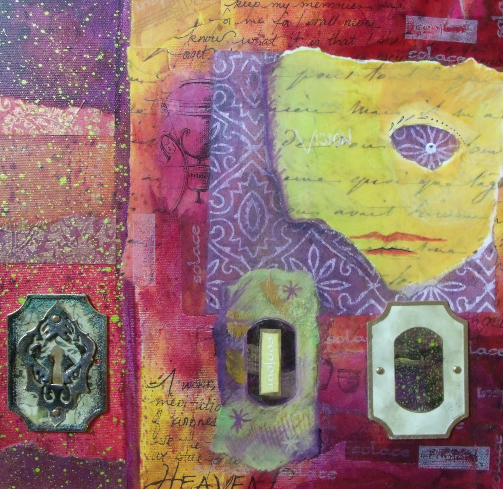
 snippet of acrylic/mixed media assemblage
Another series still in the works. I have no doubts that it will be finished. There are only 7 paintings to this series to illustrate the chakras. This is the first one that I did because it was the first one I needed to work on. Odd how that works.

I've updated the photography since I have a camera that is way better than the first one that I started posting with. And slowly my camera skills are sharpening. Photo editing software still has to help me soften up the rough spots  and compensate for some limiting lighting issues. And I really wanted to be able to do macro shots of the "cool" parts like they do with Somerset Studio. So this is a macro shot.

This is one of those things that I know I won't finish without Photoshop which is *mumblecough months away from happening. I have a very specific project in mind with the set. So while I am saving up for the software I have plenty of time to figure out what the other 3 Chakras have to say to me about their nature.

Visitors Count