Showing posts with label art history. Show all posts

Tuesday, April 15, 2014

You're Ruining the Art Market, Sotheby's


In a short list of things that really make me angry this is one of them. Let me introduce you to Barnett Newman. While being a fellow artist and Aquarian, I am tempted to love him in spite of my anger just because we have to stick together. Why am I angry?

Because of this article. http://twentytwowords.com/canvas-painted-blue-with-a-white-line-sells-for-nearly-44-million-4-pictures/ Because ANYONE can paint these paintings. Maybe not 10,000 monkeys with sable bristle brushes as they lack sufficient attention span for such a huge undertaking. But any, ANY, human being on the planet can paint this! I can make this on pickmonkey in about 4 minutes if I didn't have a monkey's penchant for distraction.

This is his wiki article. In it, the author states that he is considered one of the foremost of color field painters. So first, we have a term for what this is called; color field, a sub genre of abstraction. And this seems to suggest that he is on par with Rothko, Kandinsky and Mondrian, more so with Mondrian obviously. Secondly, let's face it... blocks of color representing whatever the artist tells the audience it represents is the same thing be it color field abstraction or neoplasticism, associated with Bauhaus, de Stijl or whatever. It is the same thing!!!!!!!

The difference between these guys hawking their wares and the average Joe Painter is that their prowess for bullshit is unmatched by any other skill which they might possess. How can I say that? For one, anyone with a huge canvas, a roll of frog tape and some paint can paint a pane of blue with a white stripe. For two, this excerpt from Wiki:
 Utilizing his writing skills, Newman fought every step of the way to reinforce his newly established image as an artist and to promote his work. An example is his letter on April 9, 1955, "Letter to Sidney Janis: ...it is true that Rothko talks the fighter. He fights, however, to submit to the philistine world. My struggle against bourgeois society has involved the total rejection of it."

He wrote this to Mark Rothko's agent Sidney Janis. And in the 40s he destroyed a good chunk of his work. I'd say in destroying it he really did totally reject the bourgeois-iness of the bourgeois. I don't know how you can call this skill. It isn't like Impressionism, in which the entire structure in the creation process is flipped on its head. There are no gradient under paintings, no washes of color built over the tones, smooth brushstrokes to emphasize the ploy of reality. Impressionism was thick, visible, bold strokes of barely defined planes in which color and light do all the work of the under paintings in the realism of the Old Masters. And it was so different, so ethereal that it jarred the senses.

I will grant you that abstractionism is as jarring to the senses of one accustomed to the work of preceding eras. I will also grant that some abstraction is wildly fascinating. Kandinsky's work does have structure which try as I might, I can not fathom. His is not the work of an elephant with a brush and 14 cups of tempera paint. It has rhythm and motion, pattern. Mondrian as well is pattern. There is something to the work. But Barnett Newman's work is all in his words..... his skill as a busker.

Enter Sotheby's. As the link says... they sold it for 44MILLion dollars.
As I said on Facebook:
At that price you'd better be able to hold a black light up to it and find the cure for cancer, AIDs and class stratification.


You can call this whatever you want. Cathedra is what Newman called it. So on the right.... any number of options I could call this. Other than the fact that this is a statement of protest, this is not art either. It is expression. But it isn't art.


Go home Sotheby's, you're drunk.

Tuesday, February 4, 2014

Swatches: Byzantine Colors

Apparently they are the in thing these days. I find them all over Pintrest. I have to admit, I love picking up paint samples and letting the colors seep into my soul.

Since the interest in Byzantine art is rekindled and I've been drooling over the Alhambra and Constantinople (Istanbul.... Yep. The song is in my head too.) I decided to make a swatch of the bold, beautiful colors used in mosaics and iconic paintings of the Byzantine Empire.

All the tedious research can be done here. If you have the National Geographic magazine from 1983 you are a few steps ahead of the curve, especially if you got to keep the map. Otherwise there is inspiration to be found right here.

The pun is just a bit of extra fluff.

Sunday, December 22, 2013

Strength in Solitude

As I am embarking on a new personal journey, the question of solitude has come up. Again. In many ways introverts are completely comfortable with the concept of seclusion, especially in the creative arts. However.... and you thought there was a but coming, however; introverts don't always want to be alone. Ideally we would like to be with an extrovert that can be our world representative. I think. Maybe it isn't fair to speak for all introverts. I speak for myself and say it is nice to be able to share the quiet and be connected to someone.

It's hard to find people to do that with though. So many people in the World freak out over the concept of spending time alone that we seem weird. There is almost always something wrong with people who need a lot of time alone. I have a friend who just made bread from the mold of a grape found on a walk.... it's yeasty good bread raising mold. But those things take time to cultivate and work out to perfection. Those things don't need an audience in the experimental phase. But they do need an audience for the reveal and the applause. Accolades are just as important to introverts but we feel like we have to work harder. And that takes some time alone to be the genius.

Reflecting on that, I found words from the Impressionist Paul Gauguin. And this is the result:

Monday, December 16, 2013

Die Entfernung


So artists got a great Christmas present a little bit early from the British Library & Microsoft. 1 MILLION gifts of copyright free/public domain images. I found this great graph and fell in love with it. Keep in mind Math and I are still not very cordial with one another. If Math had junk I would punch it.... several times daily. I love logic just not the tedium associated with its actual moving parts.
 
This particular graph is for finding the middle point (mittelpunkt)of a particular thing (Karten). Die Entfernung is the measurement. Instantly put me in mind of one of my many favorite Matthias Reim songs, Wie Man Liebt.
 
He describes how we are free to our youth until school starts and then are heads are crammed full of many things we will probably not need (Physik, Chemie & Algebra, assorted historic points and how to measure the distance between stars) and are never taught the things that we need to know, the ONE thing we need to know... how to love.
 
We teach kids how to make war, how to build empires with technology and economics but not how to love each other. Or, as I am a champion, to make art and music and nourish the soul in addition to the coffers.
 
I loved to learn things because it kept my mind busy.
 
But oh how I would have a heart as full as my head.


Sunday, December 8, 2013

Blast from the Past


So way back in 2000, my stampin friends and I decided to participate in this cool paper study project that Michelle found. It was to be our way to keep in touch as she was off to the East Coast. Note to self: Xmas windows In NYC

We'd only gotten a few projects in when life threw us all into a dither and the book found a quiet nook on a shelf and sat neglected. It's moved with me everywhere because I can not bear to let it go after Michelle went through the trouble of putting it together for each of us. And now.... digging through it again. I want to make this my project to finish this year (2014) just commit to one page a month. I can do that.

It will be interesting to see how things have changed, or not, since 2000.

Wednesday, September 11, 2013

Reblogging: A Change in Policy

Originally, when I started this blog is was to be just for my own art. Spilt Paint was to be about my work and selling it, promoting it the best that I could. It occurs to me that I have been very shortsighted in a way. And by focusing on myself and my work, I've cut out a vital part of what being an artist is: the things that inspire us.

I posted that cartoon from Rhumer. And today I am going to link to a blog that I have been following. And the reason for that, aside from it being well written and an important message to other artists, is because of something that Amelia said:

Being an artist isn't something one does in 3 years anyway. It's a LIFESTYLE; a way of being; a mode of ongoing thinking and existing ad infinitum.

Art is a lifestyle. If van Gogh's life and death, taught us anything it should be that. Artists are essential to the human condition: feeding the soul, healing wounds, being there when there is not an earthly person to depend upon. Since artistic endeavors look so much like play and not much like work artists tend to take a lot of abuse from the people who could most benefit from our passions. And becoming a paid artist is a lot harder than one could ever imagine.


So I am linking to 101 Bird Tales article here. http://101birdtales.blogspot.com/2013/09/how-to-diy-art-school-education.html?utm_source=feedburner&utm_medium=feed&utm_campaign=Feed%3A+101BirdTales+%28101+Bird+Tales%29 and telling you all to go for it. Unless you live in the frozen tundra (which is now melting under your feet) you are not too far away from a resource that will let you develop your natural talents. I am close to the tundra in that there is not much that is close to me that I can afford to attend on a regular basis. But I do have the power of the internet and the gift of serendipitous discovery: I can manage to fuel my imagination.

But I can not do it if I am only focused on myself. Look at every artist out there. They belong to some kind of a community. My friend Michelle is constantly in contact with other artists. They feed her and she feeds them. I do not know it musical artists do the same thing... I assume at some point they must, Sting and Dominic Miller being one example. But I do know that without constant immersion in art the well begins to run dry.

That is most likely the root of my current dry spell.... in addition to a profound discomfort in working conditions. There are things still brewing, fleshing out the Unverwundbar and Unendlich inspired pieces is taking a bit of time. Honestly, I don't usually plan pieces so carefully. I mostly work with a slight concept and work the kinks out as I go. This time is different. Still.... I need more art to fuel my own ideas because that is how the process works.

So I think it is time to spice up the Spilt Paint blog with a bit of the things that I find inspiring. I see being immersed in all things BBC has given my writer's imagination some fire for creative thinking over at 6°. So it is time to see what I can do with this one.

A Little Something Fun....


DeviantArt artist Rhumer graciously gave me permission to blog this. The Doctor Who Hub found it and posted it yesterday. This is hilarious... and would explain so much. Here is a link to the deviant page.
http://www.deviantart.com/art/Vincent-van-gogh-175543323

Visual Treats: Chihuly Persians

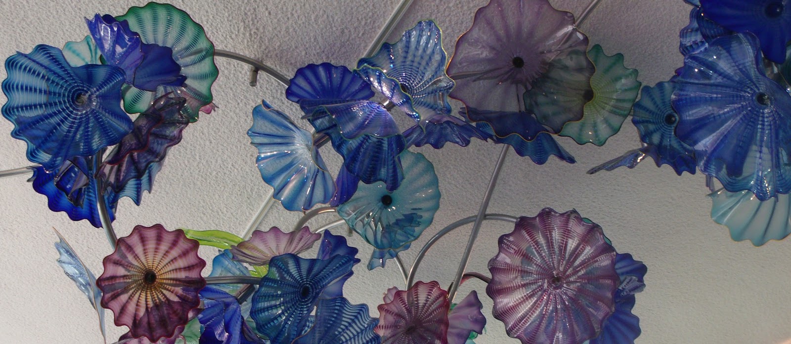
I am not sure what I can really say about this next set of photos from my vacation.  I am glad that we decided to get expensive food to revive us for the rest of the viewing at the Sculpture Park. If we had not then we would have missed the awesomeness that was.

ME: (stumbling and nearly lethargic) Where is the café?
ROOMIE: (staring straight ahead and pointing at the wall markers) It says this way.

[The low ceiling is dark on such an overcast day. Feels like a cave.]

ME: I'm dying. (eyes flitting shut as body temp has risen to an alarming degree)
ROOMIE: We should have had more coffee or breakfast.

[Suddenly the ceiling height rises, sunlight fills a pool of tile on the floor, attention shifts from body pain to....]

ME: OMG!!!!!!!!


IT'S A CHIHULY!!!!!!!!!!!!!!!!!!!!!!!!!!!


I frantically dug out the camera took this shot then walked into the café proper. And what did my wondering eyes behold?


A ceiling full of Chihuly Persians. Never in my wildest dreams did I think that I would get to see these in person. The visual feast that is his murano processed glass is something that you just have to see in person. A Tacoma, Washington native and resident near Seattle, Dale Chihuly brings color to the art scene in more ways than one. His work is shown around the world. If you are a fan of the show Frasier then you have seen Dale Chihuly's work already.
 
I snapped tons of shots of the ceiling's rainbow assortment of Persians. And after six hours of near non stop photography I killed the batteries with the last photograph. I would have to buy more batteries to finish the indoor gardens.
 

I could wish for sunshine all day long. I think it would have made everything in the park stand out more. As it was we had overcast skies and there is little that I can do about it. What I like about his work is that it is radiant in spite of its surroundings. There is just no mistaking a piece of his glass for anything else.


These pieces found themselves somewhat better lit by virtue of artificial lighting. The one shot that I wish I had gone back for, no matter how sore my feet were, was the shot underneath the chandelier. How I would love to have laid under it to look up into that medusa form and feel smothered by light.


Monday, September 9, 2013

Pond wanted a New Van Gogh & She Got It

It would seem that the Doctor heals spirits as well as rifts in time. Just unveiled, published 3 hours ago by the LA Times, a new van Gogh. Things like this don't just happen. Not in the A to B, one foot in front of the other lives that we live. We are so accustomed to life being linear and unyielding that we forget that there are miracles of a wibbly wobbly timey wimey sort. And this is a case in point.

Several remarkable things in this story give my giddy Geek plenty to squee about. So much so that I am not sure which blog this story belongs to. First the director of the Amsterdam Museum that authenticated the work looks a lot like the guy in that episode that played van Gogh. Second, the whole discussion in that episode from Pond with her wanting to extend his life for there to be hundreds of new paintings

Amy: So you were right. No new paintings. We didn't make a difference at all.

The Doctor: I wouldn't say that. The way I see it, every life is a pile of good things and... bad things. The good things don't always soften the bad things, but vice versa, the bad things don't necessarily spoil the good things or make them unimportant. And we definitely added to his pile of good things.

The Doctor, later in the Museum: And... if you look , maybe we did indeed make a couple of little changes.

The new van Gogh comes from the period in which the Doctor & Pond visited with him. And yes, I know that it is just a TV show. I know that this is fiction and that in the real world there are no Time Lords from Gallifrey... but I also know that this is how wonderful story telling is done.

The process for authenticating this piece began in the 1990s when the Belgian owner wanted to sell it in the first place. This story has been circulating for a while. And mostly ignored by the rest of the world because we have all been side tracked by wars, plane crashes, celebrity gossip and the like. So somewhere, some when, some one wondered what would have happened if the Doctor had visited with van Gogh. Myself, I wondered after that episode if he might not have kilt him.

In the 6 month period prior to his suicide van Gogh was in more than a little slump. He was talking to his brother about maybe giving up. He could not make his hands do what his mind saw. And he was overly critical of his work... lamenting the haystacks series as failures. This is referenced in the episode. Someone helped him out of it. Theo paid his bills but he wasn't the best source of comfort as far as I can tell. So how did he get out of his funk?

And what all did he paint? 36 x 28 inches is not an incredibly huge ordeal in acrylic by todays standards but it is apparently in oil back in the day. The thick impasto application of oil paints would take a few weeks to dry. How many canvases could he keep going at once? And what happened to make him want to shoot himself?

Just look at this painting


Of course seeing it in person is going to be better. The first pics I saw gave very little contrast between the fore and mid ground so that it looked like little more than a slathering of greens. However, this one from the CBS page shows contrasts in the seeming monochromatic fore and mid grounds. There is just a bit of bright blue dashed about for the eye to follow back to the blue horizon and that fabulous outcropping of buildings. And I would have to say that the gable end of the one building looks an awful lot like a T.A.R.D.I.S in disguise, Tardis blue being the unifying compliment in this piece.

Perhaps Sunset at Montmajour is something else that he considered a failure. Perhaps the flatness in the cluster of trees up front that is little distinguished from the row in the back infuriated himself to no end. Perhaps there was not enough shading in the foliage to make him happy. Perhaps.... when he decided what was wrong with it and tried to fix it the paint was still too wet. Or worse, the thick layers of oil paints would not yield because they had dried.

Here's the thing. If you stare at something long enough you will find all the things that are wrong with it. If you stare at perfection long enough you will find ugly. I'm an artist. I know that not every stroke I put on a canvas is going to be perfect. It isn't about the individual strokes. It is how they all work together. And when you fixate on one little flaw it will ruin the experience of the painting.

When I first saw this my heart leapt out of my chest. It is breathtaking. And it is calming. Personally, I would like to pull up a lawn chair and have a good read in that grove of trees. Sure... it's no Starry Night. But... this is impressionism. We aren't looking for road signs when we sit with the Impressionist Masters. We are looking for their company, for the feelings that they felt, we are hoping not for a history lesson but for community with our emotions. You can pick apart every single work by every single master and find something that doesn't sit well. They won't be glaring flaws like my misshaped apples. But there will be something.

When you are the artist you find the flaws faster because you have the map in your head of how it was supposed to be. Plagued with a notorious demand of perfection from ourselves we will judge our own works far more harshly than anyone else would. Once a guy like him fixes on the things that are wrong there is not a lot anyone else can do to help him out of it. If Sunset was part of a string of paintings he considered "failures" then the shooting becomes more understandable. Not justifiable but understandable.

In either case, he proves over and over again that art is not as easy as everyone makes it out to be; that art is subjective and sometimes the customers know best; and we always want more from our heroes than it is possible for them to give. Except in this case it is possible to have more van Gogh.

Visual Treat: The Horse

Sometimes it is good to get away and see things that challenge or update your own ideas of what is and is not art. I had a lot of that on vacation. It was a spur of the moment thing, we weren't really planning a full out minute by minute itinerary for this trip. My house mate said Grand Rapids and I said "OK." Even when she mentioned the sculpture park I wasn't too enthused. There has been a lot of that lately. But when we got down there I suddenly remembered "THE HORSE!!!!"

da Vinci modeled a horse for the Sforza clan for a commission by the Duke of Milan. The whole statue never was built. The clay model ever got beyond the construction of the horse before it was used for target practice when French soldiers invaded Milan. A few centuries later an American named Dent decided to have it built. The process began in 1977 and was completed just before I went to school in 1999. The story was huge. Every paper carried full page spreads of the newest installation at the Frederick Meijer Garden and Sculpture Park. And I was even more excited to get to art school than before.

Life gets in the way the way that it does and it is 2013 before I even think about getting there to see it. When I remembered that he was there... this great war horse of da Vinci's, I felt the fire for art that I haven't felt in a while. I needed desperately to connect with something outside of myself again.

And so....


Looming over a piazza built for him, the stallion is an awesome and fierce looking thing to behold. He can be seen from many vantage points within the garden park. Thankfully my zoom let me get up close and personal for this shot.


It was a hazy day, incredibly overcast with threats of a good shower. Amateur photography is difficult on a day like today because I don't know how to compensate. Just now, while uploading this photo I noticed the rays in the shot. Glorious!


There are three models of the Horse. Here the littlest and the biggest stand in the same pose and the same direction and look like a father teaching a son about military precision stepping. The tiny horse is meant to be touched and enjoyed. The large one can be "hugged" if you are so inclined. I was a bit overwhelmed by the sheer size of the thing and got a small case of vertigo, so I kept my distance.
 
The medium sized horse sits perpendicular to the others. One should not "ride" the horse but it is of a size in which one might; though, I think it is still not enough hands high for a proper wartime mount. But for the purpose of photography the medium horse is still a magnificent thing to behold. You can get much closer to the details in the mane and face than with the behemoth in the piazza. And, if you go up around the wall enclosing that part of the piazza, lean a bit against it to get your bearings then you can see this....
 
 At this vantage point you are part of the sculpture. You are on one horse and looking at the horse of your opponent in battle. You are about to lose your shit and it feels like there is very little you can do about it but muster some strength to fight like a Klingon or

piss yourself and go home.


And I wonder... if the Trojan horse was not this magnificent why the hell would they let the thing into its walls. Any thing less than this is not a gift but an insult. Troy should have known better and since it did not it got what it deserved.

If you would like to see these animals for yourself there are two options. Grand Rapids Michigan at the Frederick Meijer Garden and Sculpture Park or the Hippodrome de san Siro Milan.

Monday, July 15, 2013

Meet Artie: the inscrutible Miss Tessa


Because every warehouse has to have a supervisor stuck in the dark ages of technology to keep an eye on the minions, keeping them close but not too close, making sure they don't screw anything up... there is this gem of feline superiority.

My roomie's cat, Miss Tessa. Sometimes called Bugs, mostly she avoids me. I am not her favorite person only because, in true cat fashion, she only likes her human. And I am not her human. When I am in the basement she is always there. I think to make sure that I don't mess up anything that she has gotten accustomed to. And today.... I messed up her life.

I've moved a few things that I think she might have been using as cover to hide from the kitten. He is still a furry ball of furious energy and likes to torment her as all little brothers do. But he doesn't like to be where the action is. He'd rather critique after the fact than supervise during. Anyway, it took me a while to realize that I was being watched. For the longest time I thought that uncomfortable stared at feeling was coming from the lone window to the outside world. But no... it was a cat.


She was watching me unpack and photograph box number three.


The unfinished (obviously) start of a watercolor from about 2002 or 3. And a page from a block of water color exploring the technique of multiples on a theme. I think that it could be a successful trick for people who like to work in miniature. This learning experience taught me that I get distracted by the other blocks when I am working in another one. I do like the one top left. It is my color way. The bottom right is too jarringly bright. The red block? I got bored drawing those sunflowers.


Oddly though.... I don't get bored with stargazer lilies. Of course I grew them for my reference materials. But again... stargazers have a special meaning. And the sunflowers were to be marketable.

My great take away from this set.... I wonder if the masking tape will ever come off. It's been there for a decade.

A DECADE!!!!!!!!!!!!!!!!!!!!!!!! HOLY SHIT!!!!!!!!!!!! Really where does the time go?

Sunday, July 14, 2013

Box 2 continued...

I am not sure why Blogger does that when I am uploading multiple images. This is the second time that I have tried to add a second batch to a post and it decided not to let me see my library. If I were a paranoid Spook* I would think it was the Russians. It doesn't help that all of the spam in my stats is coming from Russia. So stop it if you don't want to get blamed! Oh... right. The bots don't actually read the posts.
So, moving on with the last post:


These lemons were from Jennifer Harrison's art class. The graphic representation of 5 in a complementary color was the assignment, if I am not mistaken. The left is done in acrylic. I love acrylic because it let's me work with texture. I am a very tactile person. The left is in watercolor. The graphic "advert" style on the left is fun to do once in a while. I need to do work like that to take me out of the rigid adherence to reality that sometimes I get mired in. I can not do that kind of simplification on a regular basis. Jennifer kept encouraging me to make more decisions in the realism with the reduction method in mind.

It helps your brain edit out the things that just don't matter. And she is right. The acrylic makes a strong statement. Those lemons are "gift wrapped". Definitely a life lesson in there. :)


You might think that these apples are watercolor. In a way they are.... it is acrylic wash. A lesson from Jennifer about playing with your medium to see what all it can do. 


My hands. I purposefully did two left hands in this drawing for Glee Fenby's class. I can not draw left handed. And  my right hand is not exactly photogenic. That is my own bias, I have no deformity. I just don't like my right hand.


The self portrait is woefully misshaped and distorted because it is a vertical orientation on an 18 by 24 inch piece of paper and I was working flat. It is the same issue I have with the peacocks that I started this past Winter.... accidental forshortening. It is me.... one of the best self portraits I have done. But I look like I got caught in one of Wesley's distortion field projects in school.

 The drawing pad containing all of my assignments from our text book in Glee Fenby's class and the only project I was not going to be embarrassed to post: from Commander Mark's book that I taught my daycare kids with 10 years! before I got to school myself. I loved Mark Kistler's program until my mom did what she always did and went off the deep end competing with him and then me. There is some thing distasteful about an adult that has to find a way to put down little kids.

Speaking of Russians. There was a kid who got to be on the show quite often. He was good. He could out draw Commander Mark, and Mark said so. He also said that was the point and the hope of every teacher: to have the student surpass the master.


 After a full 6 seasons of Doctor who I look at these chess pieces as Daleks in disguise. I need a break from BBC.

And I need to figure out what my eyes are doing when I have multiple objects in a painting. At first glance this watercolor still life is astoundingly talented for someone who at the time was new to watercolor. My glass is not as screwed up in the symmetry department as is usual. The banana and peach are well shaped, shaded, balanced and placed in the composition. The purple fabric is very natural and soft looking as it should be. But then you look at that apple. WHAT THE FUCK!!!!!!!!

It looks like the peach smashed into it and collapsed the thing! The apple should have it's left side behind the peach. Instead they look like they are competing for space and it ruins the whole thing. I'd like to say that was a freak, one-off accident. But it isn't. As I was taking photos today I noticed that is a recurring problem in my work. Now if it is something that is happening with my visual cortex then I have a huge problem. If the issue is that I don't stop often enough to step back and look objectively then I need to change my methods and the problem is fixed. Of course by the time I get the  drawing done I am so starved for color that I could just be rushing myself... in which case that is a discipline issue.

either way.... that is at least 15 hours wasted. There is just no way to make that yellow apple melt into the green background behind that damn peach!


 And then there is this: yet another reminder of my ex-fiancé. A graphic representation for Jennifer Harrison's class. I think that this was the last project of the first year. Matt and I were either in constant competition or constantly encouraging each other. This is a project in which he gave me permission to use his handwriting to model the letter "A" in an art nouveau style. And the homework is explained in the 5 areas of the project itself. The technique used tricks from my rubberstamping days. Glossy paper, alcohol inks and gold leaf pen. Simple. But stunning.


Monday, October 15, 2012

Oodles of Doodles

It's a rainy Northern Michigan morning and I am having a hard time getting my German radio station to load. Apparently the rainy season makes everything a little sleepy. I am no exception. For the first time in I don't know how long I slept a full 8 hours. But I woke at 11 to grey clouds after a brilliant dream. This always leaves me a little melancholic. The dreams I live in during sleep are vivid in texture, color, sound and lighting. Reality has a hard time keeping up.

This morning when I logged on to Facebook I made a comment from a Seuss quote about it being to wet to play. And then I popped over to google for some mail and such only to find a brilliant Google doodle about Little Nemo. Instant love. So being the geek that I am I went on a hunt to learn more about it's creator, Windsor McCay.
from today's google doodle
used without permission but
with the request that you guys
start to credit the animators who
create these amazing
bits & bobs.
~Thank you~
First I love the name. Windsor and Newton are my favorite watercolors. And, though spelled with a C instead of a K, the name McCay will always invoke David Hewlett's scientist extraordinaire Rodney the raging egomaniac from the Stargate franchise. But what I love the most about this man's work is the the strength of the drawing and the delicacy of the colors. Created in the early 1900s, the Art Nouveau style is very apparent in his work. The first thought that I had when I saw them was of Maxfield Parrish and Alfonse Muscha.

The second thought that I had was "Who puts that much work into a Sunday comic? Of course, I grew up in the 70s and 80s where the most complicated Sunday strip was Prince Valiant. And our animated cartoons were those of Disney and Warner Bros. While Disney cartoons have a great aesthetic, they are simple things. Detailed and yet uncomplicated so as to make production easier, there is still a flatness to the films.

And then when we get into the realm of Saturday morning cartoons there was the Adventures of Tarzan, Johnny Quest and later Wizards and Warriors to fill in the details of realism that the others left out. And I wonder now if simplifying the cartoon to appeal more to children might have been a poor choice. Not wrong or bad but poor. I love animation. I fell in love with it the first time I ever saw a cartoon because I recognized it as art. However, I know that as I got older, 8 or 9 maybe, I wanted there to be more substance. The world was not overly simple. The rush of images that pass us in our daily lives get noticed when we are kids. But we may not always have understood what we saw. I think that is perhaps why Japanimation and Anime have taken the world by storm. It does not filter out the complicated or the bad and the ugly in human or anthropomorphic behavior. And I can see all of this in the things that Little Nemo encounters in his dreams.

The comic was hugely popular in its time. And it was one of the first animated films. Not THE first, but one of them. I think that the popularity of them is because we all know that we have dreams in which we live the action. There is evidence upon waking. The drug our body uses to paralyse us in sleep is weak or wears off and we thrash about. This is the dream life of Nemo. And I think that part of the appeal is that the child who can not tell his or her parents what the dream was about and is confused by it will see this comic and know that they are not alone in their adventures. Kids encounter the complicated things of life all the time. But not many adults take the time to help explain it.


borrowed again
 
And the popularity of his work among adults would be, perhaps that the real world textures and layers now have a dreamy quality that puts a little more color into the Industrial Age in America. You know, I look at this next illustration, gleaned from the net most inappropriately, and I see that the era of Steampunk began in the 1900s. It doesn't take us back to the beginning in the manner of homage; it has always been with us... just hiding a bit.

The illustration to the right juxtaposes the modern 1900s with ancient architecture and some fairly, in 2012, fanciful ideas of hydrogen power. I see a city that would never have been built because of the clash between the modernity of convenience and the grace of traditional living and a city that will never bu built now because exterior ornamentaion is a colossal waste of money and material. And certainly the irrationality of fanaticism would prevent such a wondrous place from existing in the future. Purists would pale at the thought of Asiatic and Roman design commingled in a single structure such as the shadowy building on the left. I am certain the upon seeing this there must be a few 14th century Italian architects bristling at the thought of Roman viaducts and duomos being the foundation of such a conglomerate monster such as the central building cluster. Which, may I point out, looks very much like it could have been cut and pasted onto the cover of any fantasy novel of the 1970s, especially the cloud cities of Marion Zimmer Bradley's worlds. Shoot... if Tolkein's Lorien elves were all about building in the open this could very well have been one of their spired cities. Behind the blue dome, fading in to the mist I see something that would be comfortable on the Klingon home world.

I think in all of this mornings travels, the thing that most entertained me about McCay's work is this last photo. Because the first thing that I thought when I saw it is the first thing that you are thinking...


Thank you, Google, for the excellent doodle and teaching me something that I didn't already know. I almonst take back what I said about book research being better (in the aesthetic sense) than a Google search. What a great way to spend a rainy morning/afternoon.
 

Visitors Count