Monday, January 27, 2014

Thoughts Turning to Spring

I know that it is not as bad as the big Winter of '78. Nor is this Winter much different that a two month stretch in '07 that wrecked havoc on my budget with excessive plow bills. But this is a long and annoying Winter none the less. We have been spoiled these last 20 years with little snow fall and the ability to walk around like it is still Fall for most of the bleak white season. This year though, my patience is tried to its last bit of strength.

In a few months I will be moving again. For the most part everything will go back into storage, I'll be crashing with a friend for a while to save some money and with any luck I will not have surgery on those hamstrings. Yes.... it is getting to that point. I'm in a level 3 constant amount of pain in both legs and over the last two days I am losing the feeling in one foot... the one whose hammie has been torn twice. And the back is not cooperating. Every time I get stuck without the benefit of the boyfriend's assistance I do more damage. Oh if only I could stay home when he is not here!

With these trials and constantly numb fingers I find myself looking forward to Spring. Not because I want to move heavy stuff around. But because the color will come back like a slow spreading pinkish orange sunrise. I have the newest issue of Somerset Studio and this is the article that I want to pour over the most.


photo: www.stampinton.com, artist: Heather Jacob. See her awesome blog at www.heatherandlife.blogspot.com
Yes, borrowed without permission and edited like mad to avoid the impression of digi-theft.
Full credit where it is due... this is wonderful.
Seriously... check out her blog there is even more wonderful stuff there. Showing link love on the right too!  

 Oh no, not because I am a scrapbooking fool at the moment. But because I like the way her negative spaces gives you a chance to breathe and dig deeper into the work. It is filled with great bits but the work isn't cramped or crowded. It spreads out a bit.... like a cold tired somebody stretching into the sun after a dark and cold winter.

The stark white pages, like our stark white winter bursts with color. This is the article that grabbed a hold of my imagination on first and second look. It has that Boho Chic whimsy and the Shabby Chic simplicity that really speaks to me right now as I contemplate another move. It speaks to me as I am trying to stretch into Spring to break the grip of cold that runs through and across me every day. Even with my Sweetie by my side I feel the cold creeping.... he warms my heart. And he inspires me to be more than I have been in the last few years of conflict and fleeting peace.

We talked about Art. The making of it, the process and the absolute desert that is the home when I am fully involved in a project. We talked about the things that take him inside of himself in a similar way. So we already know there is conflict between Muse and Life, between Egos and Encouragement. And we are already preparing for the eventuality that we will chose to live together somewhere and make our dreams come true. He isn't an artist in my medias, but we shared an art class so he knows how the process becomes entangled. He is an artist in the kitchen. I am a mere foodie in his presence. But I know the rapture of a well executed meal. The pain of plating and the foibles of study that let him become better at his craft even after his 25 years of experience. And he knows that culinary art is the same to him as my media are to me. So we know. But can our egos handle it?

I think so. And somehow... Heather Jacobs' work seems to convey that feeling to me... the growing together and yet independently. The mutual success. The encouragement and the praise for each other. I think that the red so close to the mid February Hallmark holiday may also have something to do with how I feel toward this particular article.

My thoughts are turning to Spring at any rate. There is so much to do between now and then. And so much change coming. Good change. I am actually not afraid like I have been in the past. I think that means that things are settling in my fluttery, little anxiety-riddled heart.

I picked up artful blogging this week too. The cover is a few shades of Winter Blue darker than the persistent steely blue grey skies and lifeless evening shadows outside. Crisp and brighter, this has me thinking Spring again. Still. Also. And with those thoughts, I think of how to make the blog fresh again. To bring it into the Spring season and celebrate the warmth to come. While I think, I shall read. There is a lot of great information in this magazine.  As I absorb and assimilate the posts here will be rather small and scarce.... or maybe just scarce. So get your art fix with the links at the right and see what others are doing.

You'll love it. I promise!


Wednesday, January 22, 2014

Organizing

I'm laid up for a while again. Hamstring again. But at any rate, while I am laid up I am working on organizing my Pintrest™ boards. While I was working on the boards, I came across a new artist in the illustrations pins.

Her name is Irina Vinnik, a Russian illustrator. Her work is remarkable. I will let her work speak for itself. This is January from her new calendar.


It is amazing how much there is on Pintrest. Its a great way to spread the love around. Especially since the thing is so random. Everyone anywhere can post things. Slide it under a header and the whole world suddenly has access to people and places that otherwise would remain unknown.

I wish she had a blog. But maybe I can get a widget for her Behance page. Until then, here is a link to her shop.

3 in a Series

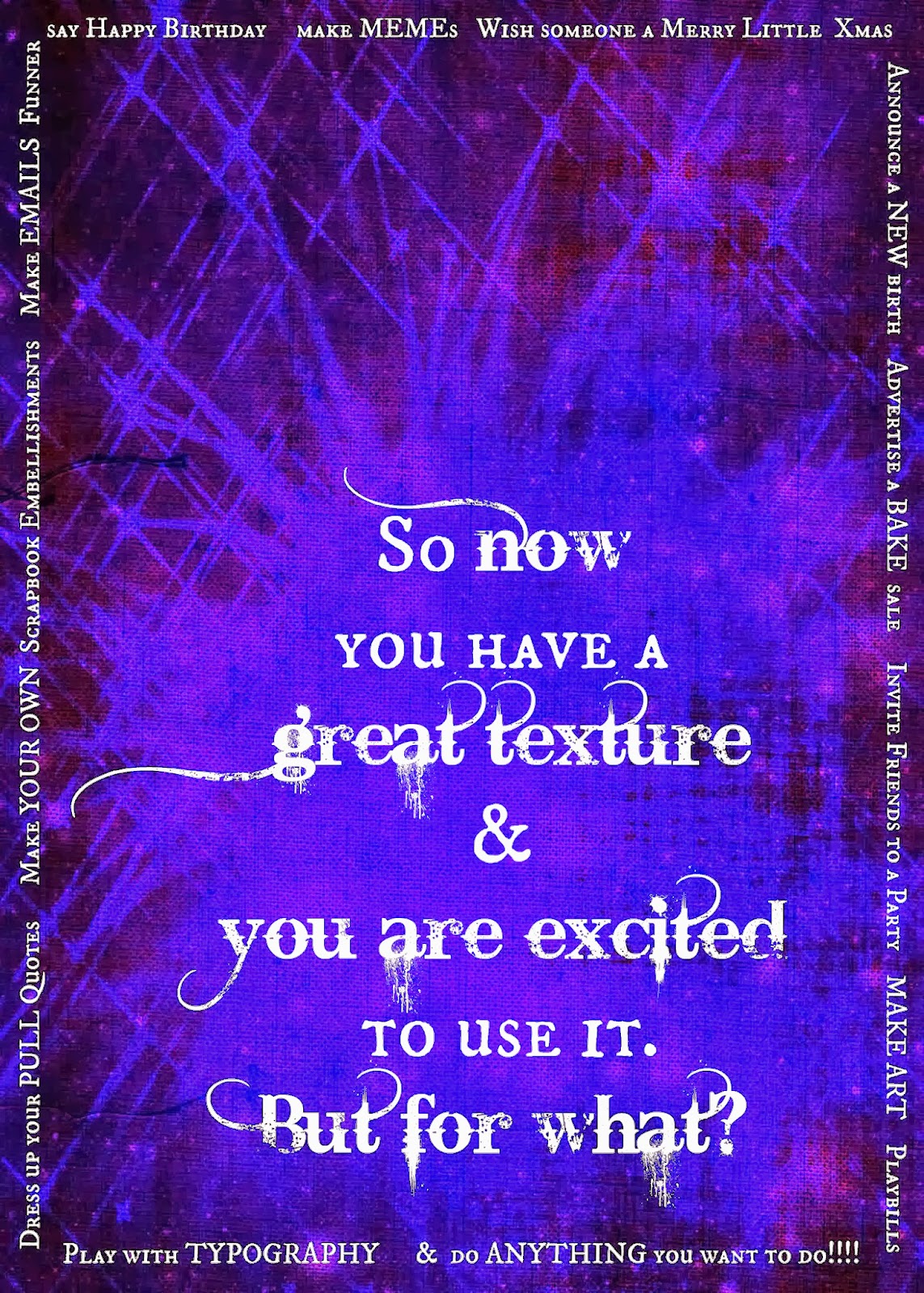
You could use your new found Picmonkey textures to create a whole post.

I saw a book for sale at Christmas that takes the right kind of humor and mixes it with my love of the German language. And I am going to steal the layout idea for my Wordpress blog on the subject of Words.

I took the same Tardis Blue™ texture I've been using and applied it to the facebook layout option under design and formatted the thing like so....


This is not the final draft for the blog project.... but an idea. It will be the only thing in the posts on this subject. So it is the post.

How can you use this idea in your own blog?

Monday, January 20, 2014

2 in a Series

In the last post I showed you a bit of graphic design by asking a question in the center and answering it in options lining the border. The difficulty right now is that Blogger© is taking some license interpreting color that it has not previously taken. So assume this is indeed a Tardis Blue™ background and we will proceed.

Open Picmonkey and select the Edit Photo option.


Select a the Overlay feature and upload a photo. I selected a watercolor mixed media of a piece of my own typographic interpretation (keeping it in the theme). Edit it by erasing the background watercolor paper. As an overlay you can not adjust the exposure. Had this stayed the way it was edited (Blogger, you need to behave) it wouldn't even be necessary because the colors were naturally compatible. Here the watercolor looks washed out.
Place it on your background and then click the Combine Layers button. This will let you add text in the next step without accidentally moving the overlay and creating havoc later.

Now select the text feature and go to town. Remember to select text colors with the eyedropper so that it is compatible with your work instead of trying to fiddle with the slider tool in the color spectrum. WHAT. A. PAIN. The eyedropper is selected via the long box alongside the color spectrum the default is either black or white and changes as you run through colors so that you can see what you are sampling. When you have a color you like, a code will appear over that box. Copy and paste this if you are using multiple text boxes and need the colors uniform.

SPECIAL NOTE:
When using more than one typeface, try to keep the visual clutter at bay by using two, no more than three different fonts. Good formulas to remember are:
  •  Serif + san Serif
  • Display font + Serif
  • Display font + sans Serif
  • Script + Serif
  • Script + san Serif
  • Serif + Display + sans Serif: if you absolutely, positively have to use more than two fonts.
  • Serif + Script + sans Serif
Avoid Script + Display in any combination just to save the hassle of scrolling through Picmonkey's vast font selection. Scripts and Display fonts can be really clashy.... like cheerleaders on opposing teams. This option rapidly depletes patience.

In the event that your styles are too similar, or compete for attention more than you had anticipated, a good fix is to keep to one font and change the letter size or use ALL CAPS for some of the words. In a full on graphic design package like Photoshop­™ you would have access to the fancy features like kerning to help your text stand out. Picmonkey is great, but it is limited in range so these are good shortcuts to keep in mind. And you won't have the bold or italic functions with some of the fonts that are available. Picmonkey won't let you make the chaotic mistakes that Photoshop rookies make because they put limits on what some of the fonts will do. Photoshop is made by people who assume your professors taught you right, so a newb with Photoshop can make some glaringly unfortunate typographic choices.


Sunday, January 19, 2014

A Short series

Since just before the New Year I've been in love with the Picmonkey website. And you can see the wonderful things that can be done with a few simple tools and some creative interpretation. In the last post I showed you some textures in a shade of Tardis Blue ™. Sadly, somehow this is more purple here than what I was working on at picmonkey and my file reading program says it really was Tardis Blue ­­™ before Blogger© got a hold of it.

What do you do with these textures once you've made a handful of them? Here's an idea....


This is simple. Just throw some typeface over the top of it.

Saturday, January 11, 2014

Creating textures


Well back home to play with the paints. Digital paints anyway. Picmonkey added the color canvas feature to the basic abilities menu and now it's "Build Your Own Texture" time. As I wrote on the other blog about a very special Christmas event for me (and millions of others who tuned into BBC and BBC-A) I've been inspired by the color Tardis Blue. As you can see.


Sunday, January 5, 2014

2014


Yes, 2014 will bring you more digital art. Picmonkey was a great find. Another great find might make posting a rare occasion for the foreseeable near future. I love blogging and I feel really weird when I don't do it. 2014 has also brought a new relationship so there will be a period of adjusting that into the regular folds of my life.

The biggest lesson from 2013 must carry on into 2014 and beyond. And I want to remind all of you of that lesson.


Be Yourself! Be your most authentic self that you can be. Make no apologies. Allow no one to dictate to you who you are and who you are meant to be. Of all the compromises that you will make in your life let this not be one of them. Accept no substitute interests. Subvert no intention to another's will.
Be Who you are with Grace & without Guilt. Fly the banner of your own design and those who recognize its symbolism will find you and incorporate you into a larger group. Being a geek is more mainstream now than it ever was; more mainstream than it will ever be again. We are able to find each other now and build the relationships that even our most introverted brethren crave.
There is no reason to be less than you are. None. NONE. Anyone who would subjugate you under their standard of what is and is not acceptable (beyond moral codes of course) must be cut from your life as ballast is dropped from a hot air balloon. Be yourself and be truly free.

Yes, friends, it will still take a while to get to that social group that you know is out there. Yes, there will be a period where you will feel like you are sitting through the longest dark tea time of your soul. The table is set and no one is there to share it with you. Fear not. They will come.

Through yourself into the things that you enjoy. Hold nothing back from yourself. And eventually you will find your tribe, or it will find you. And this is where true happiness lies. We make ourselves miserable making others happy in conforming to their style. Let them find their own authentic people and let you find yours.

And let's make 2014 the Year that we Truly embrace Who We Are!


Visitors Count