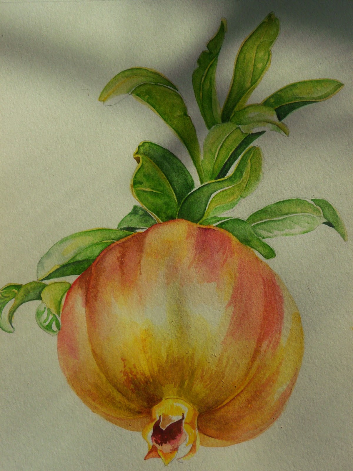
I started another project to work on while the paint on the poppies is drying.
I really like the composition in this one and the fact that I offset it this way on purpose. I had an initial vision that the more I look at this, the more I don't like the original plan. When I laid this down in the sun to take a picture I got the shadows of the trees outside cast on it. And I like the directionality to the shadows. Originally I had planned to work on something more nebulous.
I had also planned to keep a lot more white here in the top of the bulb. However, the paper that I am working with, Canson 140#, soaks up water faster than I thought it would and the Aureolin yellow that went down for the first wash had much sharper edges than I meant. My bottom yellow faded up into the Aureolin like I wanted it to so there was a bonus. I think that was a regular cad yellow in my Cottman travel pack. Now the vermillion and other red washes are a hodge-podge of whatever looked good in the incandescent light while I watched the umpteen millionth episode of Poirot for the night so I don't even know what I did to get those colors. I only know that I will leave them alone.
Green Gold and Sap green were the mid range tones over Aureolin on the leaves. The darkest greens are Green Gold and Antwerp Blue. I left all the hard edges to dry overnight and stain the paper well. The Antwerp lifts better than the green gold so today when I smoothed everything over I got some really nice results in the leaves.... it actually looks like I know what I am doing.
So far my favorite part is the potato chip curl in the leaves on the left and the one strong leaf curled to the right above the fruit. Now that I have smoothed everything over again, I need to go in with another layer of mid range green, maybe with a little viridian to make some of the olive leaves a bit bluer a green, deepen the separation between leaf sets and hit a few details with some very thin lines. While the fruit is spot on from the photo... at least it doesn't need more touching up, I still think that my favorite part of this will be the leaves.
What do you think, purple grey for the background? Or purple green-grey?


No comments:
Post a Comment