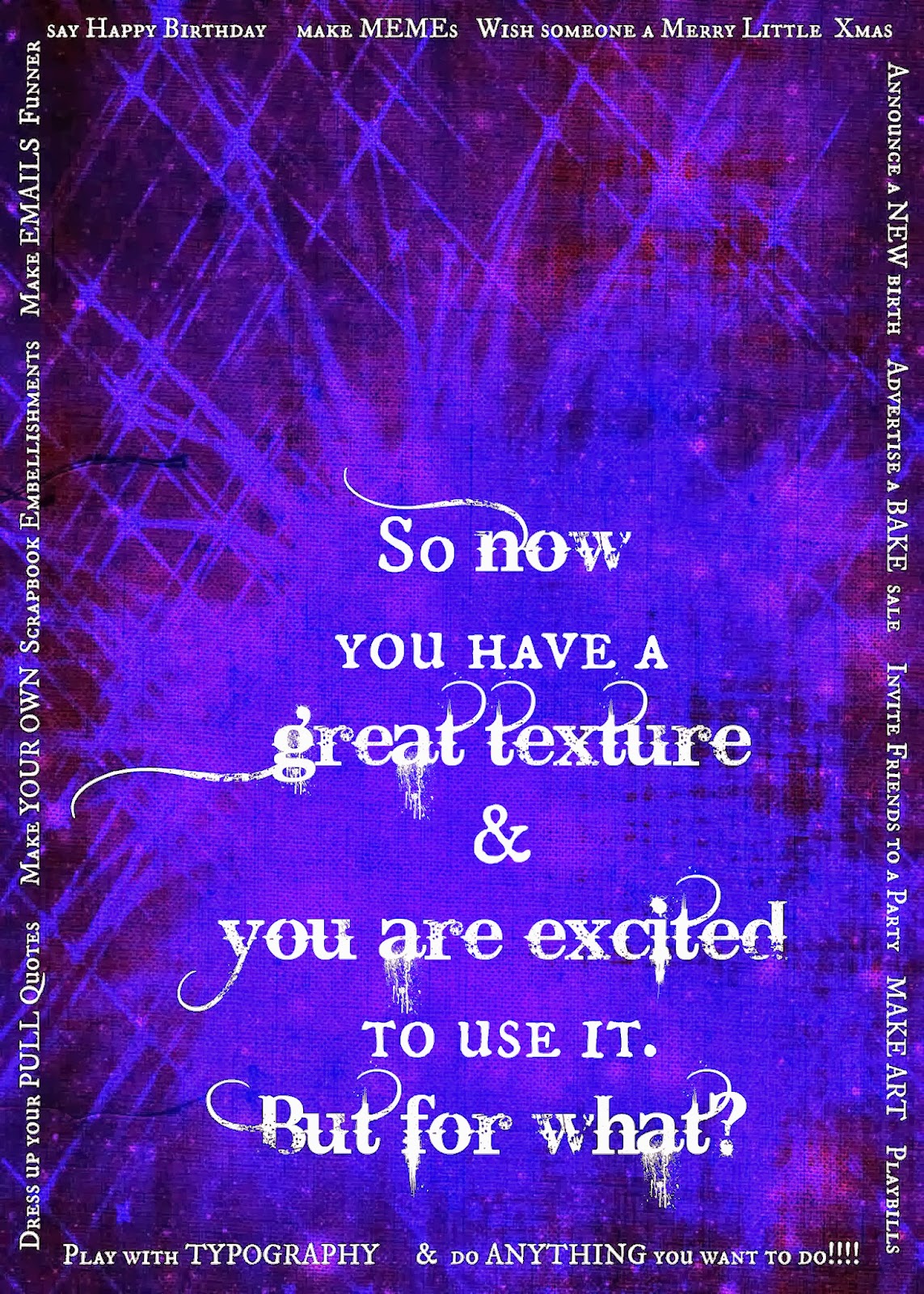
In the last post I showed you a bit of graphic design by asking a question in the center and answering it in options lining the border. The difficulty right now is that Blogger© is taking some license interpreting color that it has not previously taken. So assume this is indeed a Tardis Blue™ background and we will proceed.
Open Picmonkey and select the Edit Photo option.
Select a the Overlay feature and upload a photo. I selected a watercolor mixed media of a piece of my own typographic interpretation (keeping it in the theme). Edit it by erasing the background watercolor paper. As an overlay you can not adjust the exposure. Had this stayed the way it was edited (Blogger, you need to behave) it wouldn't even be necessary because the colors were naturally compatible. Here the watercolor looks washed out.
Place it on your background and then click the Combine Layers button. This will let you add text in the next step without accidentally moving the overlay and creating havoc later.
Now select the text feature and go to town. Remember to select text colors with the eyedropper so that it is compatible with your work instead of trying to fiddle with the slider tool in the color spectrum. WHAT. A. PAIN. The eyedropper is selected via the long box alongside the color spectrum the default is either black or white and changes as you run through colors so that you can see what you are sampling. When you have a color you like, a code will appear over that box. Copy and paste this if you are using multiple text boxes and need the colors uniform.
SPECIAL NOTE:
When using more than one typeface, try to keep the visual clutter at bay by using two, no more than three different fonts. Good formulas to remember are:
- Serif + san Serif
- Display font + Serif
- Display font + sans Serif
- Script + Serif
- Script + san Serif
- Serif + Display + sans Serif: if you absolutely, positively have to use more than two fonts.
- Serif + Script + sans Serif
Avoid Script + Display in any combination just to save the hassle of scrolling through Picmonkey's vast font selection. Scripts and Display fonts can be really clashy.... like cheerleaders on opposing teams. This option rapidly depletes patience.
In the event that your styles are too similar, or compete for attention more than you had anticipated, a good fix is to keep to one font and change the letter size or use ALL CAPS for some of the words. In a full on graphic design package like Photoshop™ you would have access to the fancy features like kerning to help your text stand out. Picmonkey is great, but it is limited in range so these are good shortcuts to keep in mind. And you won't have the bold or italic functions with some of the fonts that are available. Picmonkey won't let you make the chaotic mistakes that Photoshop rookies make because they put limits on what some of the fonts will do. Photoshop is made by people who assume your professors taught you right, so a newb with Photoshop can make some glaringly unfortunate typographic choices.