Showing posts with label artifacts. Show all posts

Thursday, July 17, 2014

Summer Break

While I am working hours I could have wished for in the Winter and not producing art I am still thinking about it. We found some fun stuff on a day trip:


A starry night fish in Elk Rapids at the marina with a view of the island house library and marina. Awesome! And then we found a sleeping bear pictoral downtown....


Tuesday, December 10, 2013

Random sketches


Some more ideas to go with the Egypt thing and the sketches for the chakra series of acrylics. I think that the only one that stayed as planned was the sacral chakra. I really like the idea behind the lekythos but it needs to be reworked. That top olive branch needs to be a bit more droopy with the weight of those fruits.

Sunday, December 8, 2013

Blast from the Past


So way back in 2000, my stampin friends and I decided to participate in this cool paper study project that Michelle found. It was to be our way to keep in touch as she was off to the East Coast. Note to self: Xmas windows In NYC

We'd only gotten a few projects in when life threw us all into a dither and the book found a quiet nook on a shelf and sat neglected. It's moved with me everywhere because I can not bear to let it go after Michelle went through the trouble of putting it together for each of us. And now.... digging through it again. I want to make this my project to finish this year (2014) just commit to one page a month. I can do that.

It will be interesting to see how things have changed, or not, since 2000.

Friday, December 6, 2013

Love it!


I really like the look of this. I think that I am going to redo it and use more precise blocking lines than just the main horizontal and vertical axis. There is way too much going on in this sketch to not use them. Things get off balance quickly.

Wednesday, December 4, 2013

#5 second post


Bottom right, look who I found peeking out at me when I took the lid off of this box. Perhaps I should quit saying that I can not draw people. I don't prefer it. But I guess I can do it. When I have tons of time. Of course what you don't see is the mistake I cropped that makes me say I can't draw people.

Another mannequin angel, a stained glass idea inspired by Michelle Ward and the stained glass windows in the old churches. I think I was reading Iris Johansen at the time, Beloved Scoundrel, a pomegranate and fig sketch.

Sunday, December 1, 2013

Artifact box #5


Among the mess I started unpacking I found a box of Somerset Studio magazines and sketch books. Some were filled, others were only partially full and one was almost embarrassingly bare. the good news there is that I don't have to shop for more sketchbooks.

Here you can see two examples of why twitter knows me as @glyphgeek, a sample of my fascination with all manner of earthen vessles, the beginning of some kind of old engravers styled corbel design (middle bottom) and a sketch for a mannequin angel. If I had to guess I would say it was from the period when I obsessively watched Stargate SG-1 and continued through the point in which I moved out of my fathers house to begin this crazy 8 year quest.

When the jar and papyrus sketch popped out at me I kinda swooned. Sometimes I have some really good ideas. And that was one of them. It started an idea for a series of rubber stamps. Seriously need to get back on that track. Just have to figure out how to get around a couple of speed bumps.

Wednesday, July 31, 2013

From the Vault


My favorite color scheme should be pretty obvious by now. This 12x12 canvas came shortly after my father died. Seems fairly evident that the loss left me feeling like I was missing some parts of me; searching for those parts. Not sure that I have found them yet


Focused on red still? Or again? This is a 4x6 with the texture paste. The stencil is my own design, cut from thick mylar. I love it. But the next time I use it I will go with the blue stuff. It is thinner and I think will leave me with cleaner edges when using the paste. It needs another paste object in the bottom right corner for balance.


I really like this tree. It is a bit cartoony in this version. But the roots have that swirly curly character that was my almost "Signature" style in school. And obviously yellow is a bit of a departure from the norm.


The pictures are a bit washed out. That is due to the lack of proper photographic lighting and a small basement window by which to take pictures. Will remedy that soon. I wanted to get these up so that I could keep a discovery journal while unpacking the boxes downstairs.
 

Artifact Box 4

This was the last thing on the table when I was told to leave. I'd been playing with texture paste and my own hand cut stencils (I know. But you have to suck it up and cut your own when the commercial brands don't have what you want.) for a while. What with the intense focus on earthen vessels and jars of clay could be better than a material that could easily pass for actual clay? So why not? So I did.

It takes a long time for this stuff
to dry.I think that this particular
canvas spent four days curing
before I ever applied paint to it.
The tricky thing with this is to
remember to keep things in the
proper perspective. Which, looking
with a somewhat distant eye now,
I see I did not quite make muster.

There is the same left-side-right-side
issue with my perspective. And the
lip of the rim is not foreshortened
enough. That being said though...

I absolutely LOVE the texture and
color of the mid-section of the jar. It
looks like it has a well worn patina...
exactly what I was going for. And I
worked in come cool compliments
so that the whole color scheme didn't get bogged down or become boring.

Man I hope that color scheme isn't boring. Now I am not too sure how I am going to finish the background. That was a schmear of raw sienna and some other yellow and lifted with plastic wrap. Of course I need to lay in some shadow colors and punch up the background. And some kind of embellishment, handwriting and maybe some high gloss finish.

This is a close up shows the colors.
All the colors were dry brushed. The
first layers were matte base colors.
Next came several shades of Lumiere.

Four days of curing turned out to be
the key to getting good paint layers
down. I had to use a runny wash
to do the body of the vessel
so that it would streak and look
like the jar had been overfilled
frequently.

Not sure how to finish this. Like I
said it was on the table drying
when I was told to leave. I packed
up an got out like it was Volcano
Day in Pompeii.
Fortunately I had never completely
unpacked when I moved in.
Uncovering the canvas feels a lot like I've dug through the ashin that famed city and found the remnants of someone's last day.

And in the timeline of my life it was a last day for
me. I am the artist and I should be able to finish it. Yet there is something in me that says it belongs in the past and should be left as it is. A testimony to a time and place that does not exist.

Tuesday, July 30, 2013

Missing No More

I'd forgotten for a while that I had framed some of my work to put up in the last house I was in before dad died. Death does weird things to your brain. Anyway, I was looking for some things to sell to the antiques dealer when I found a box labled "DEC". I figured there would be good collectibles in there. Instead I found framed artwork.

Among my pieces I found a Muscha reproduction, courtesy of Matt. And this:


framed Freesia with reflection.


Thursday, July 18, 2013

Box Number 4


Among the blanks stands a few gems:


 Three: in numerology three signifies a communicator. One of the defining numbers or my life, communication is essential to my overall well being. I must speak. If I cannot speak I must create. If I cannot create I must write. If I am left without an outlet then I become disconnected with reality. I begin to die inside.... it's very much a Holmesian problem.


One of the things I was exploring before the chaos that ensued after dad's passing: textural pastes. I really love how this layout lead from one thing to another. The amphora as a desert traveler needs something dark grounding it in that lower right hand corner to balance the 3 purple dots. And I need to wash the background colors smoother.... there is no transition between orange and yellow. It wasn't finished before it was boxed so I am not upset that it lacks some important details.


And another collaboration. I wonder where the rest of his art is that he did leave me before he left.


Monday, July 15, 2013

Meet Artie: the inscrutible Miss Tessa


Because every warehouse has to have a supervisor stuck in the dark ages of technology to keep an eye on the minions, keeping them close but not too close, making sure they don't screw anything up... there is this gem of feline superiority.

My roomie's cat, Miss Tessa. Sometimes called Bugs, mostly she avoids me. I am not her favorite person only because, in true cat fashion, she only likes her human. And I am not her human. When I am in the basement she is always there. I think to make sure that I don't mess up anything that she has gotten accustomed to. And today.... I messed up her life.

I've moved a few things that I think she might have been using as cover to hide from the kitten. He is still a furry ball of furious energy and likes to torment her as all little brothers do. But he doesn't like to be where the action is. He'd rather critique after the fact than supervise during. Anyway, it took me a while to realize that I was being watched. For the longest time I thought that uncomfortable stared at feeling was coming from the lone window to the outside world. But no... it was a cat.


She was watching me unpack and photograph box number three.


The unfinished (obviously) start of a watercolor from about 2002 or 3. And a page from a block of water color exploring the technique of multiples on a theme. I think that it could be a successful trick for people who like to work in miniature. This learning experience taught me that I get distracted by the other blocks when I am working in another one. I do like the one top left. It is my color way. The bottom right is too jarringly bright. The red block? I got bored drawing those sunflowers.


Oddly though.... I don't get bored with stargazer lilies. Of course I grew them for my reference materials. But again... stargazers have a special meaning. And the sunflowers were to be marketable.

My great take away from this set.... I wonder if the masking tape will ever come off. It's been there for a decade.

A DECADE!!!!!!!!!!!!!!!!!!!!!!!! HOLY SHIT!!!!!!!!!!!! Really where does the time go?

Sunday, July 14, 2013

Box 2 continued...

I am not sure why Blogger does that when I am uploading multiple images. This is the second time that I have tried to add a second batch to a post and it decided not to let me see my library. If I were a paranoid Spook* I would think it was the Russians. It doesn't help that all of the spam in my stats is coming from Russia. So stop it if you don't want to get blamed! Oh... right. The bots don't actually read the posts.
So, moving on with the last post:


These lemons were from Jennifer Harrison's art class. The graphic representation of 5 in a complementary color was the assignment, if I am not mistaken. The left is done in acrylic. I love acrylic because it let's me work with texture. I am a very tactile person. The left is in watercolor. The graphic "advert" style on the left is fun to do once in a while. I need to do work like that to take me out of the rigid adherence to reality that sometimes I get mired in. I can not do that kind of simplification on a regular basis. Jennifer kept encouraging me to make more decisions in the realism with the reduction method in mind.

It helps your brain edit out the things that just don't matter. And she is right. The acrylic makes a strong statement. Those lemons are "gift wrapped". Definitely a life lesson in there. :)


You might think that these apples are watercolor. In a way they are.... it is acrylic wash. A lesson from Jennifer about playing with your medium to see what all it can do. 


My hands. I purposefully did two left hands in this drawing for Glee Fenby's class. I can not draw left handed. And  my right hand is not exactly photogenic. That is my own bias, I have no deformity. I just don't like my right hand.


The self portrait is woefully misshaped and distorted because it is a vertical orientation on an 18 by 24 inch piece of paper and I was working flat. It is the same issue I have with the peacocks that I started this past Winter.... accidental forshortening. It is me.... one of the best self portraits I have done. But I look like I got caught in one of Wesley's distortion field projects in school.

 The drawing pad containing all of my assignments from our text book in Glee Fenby's class and the only project I was not going to be embarrassed to post: from Commander Mark's book that I taught my daycare kids with 10 years! before I got to school myself. I loved Mark Kistler's program until my mom did what she always did and went off the deep end competing with him and then me. There is some thing distasteful about an adult that has to find a way to put down little kids.

Speaking of Russians. There was a kid who got to be on the show quite often. He was good. He could out draw Commander Mark, and Mark said so. He also said that was the point and the hope of every teacher: to have the student surpass the master.


 After a full 6 seasons of Doctor who I look at these chess pieces as Daleks in disguise. I need a break from BBC.

And I need to figure out what my eyes are doing when I have multiple objects in a painting. At first glance this watercolor still life is astoundingly talented for someone who at the time was new to watercolor. My glass is not as screwed up in the symmetry department as is usual. The banana and peach are well shaped, shaded, balanced and placed in the composition. The purple fabric is very natural and soft looking as it should be. But then you look at that apple. WHAT THE FUCK!!!!!!!!

It looks like the peach smashed into it and collapsed the thing! The apple should have it's left side behind the peach. Instead they look like they are competing for space and it ruins the whole thing. I'd like to say that was a freak, one-off accident. But it isn't. As I was taking photos today I noticed that is a recurring problem in my work. Now if it is something that is happening with my visual cortex then I have a huge problem. If the issue is that I don't stop often enough to step back and look objectively then I need to change my methods and the problem is fixed. Of course by the time I get the  drawing done I am so starved for color that I could just be rushing myself... in which case that is a discipline issue.

either way.... that is at least 15 hours wasted. There is just no way to make that yellow apple melt into the green background behind that damn peach!


 And then there is this: yet another reminder of my ex-fiancé. A graphic representation for Jennifer Harrison's class. I think that this was the last project of the first year. Matt and I were either in constant competition or constantly encouraging each other. This is a project in which he gave me permission to use his handwriting to model the letter "A" in an art nouveau style. And the homework is explained in the 5 areas of the project itself. The technique used tricks from my rubberstamping days. Glossy paper, alcohol inks and gold leaf pen. Simple. But stunning.


Wednesday, July 3, 2013

MO W13 First Box

Also uncrated from this box....


A portrait of an ex boyfriend, sleeping angel. And the oil on paper of a Chickadee in Winter. This has a very graphic feel too it. I can see his penchant for the 80s in this work. And lately, as I am digging things out of storage and finding tons of work from this time period, I find I miss him a lot right now.

Life, being what it is, has separated us for good this time. In the past we could always find one another and catch up. He is my Wonder Twin. Sometimes our artistic lives clashed in competition but most of the time we fed and improved each other's passions for our individual projects.

He's shown at ARTprize in Grand Rapids and has had his work shown in a few places down there. I do not know that he ever has sold much. Tis a shame... he is so good at what he does really love, anime and art nouveau. The combination is stunningly fresh, almost steampunky if it weren't for all the bright colors he used. Steampunk...... yeah... I do miss him.

Tuesday, July 2, 2013

My Own W13

I just uploaded a bunch of stuff to facebook. My sister is back online and I wanted to shove a few things at her in preparation for the onslaught of her baby pictures. Plus.... facebook is quicker and I get to try out the funny on them before launching words at you guys.

So here we go....


From the W13 Artifacts Vault, First Box:
Among the Chagalls, Degas and Victorian Cats, in a Rubbermaid repository lies tiny treasures of past artistic adventures and experiments. Unlike a real W13 artifact..... none of these things possess weird powers that warp reality or bestow superhuman powers.
Too bad.


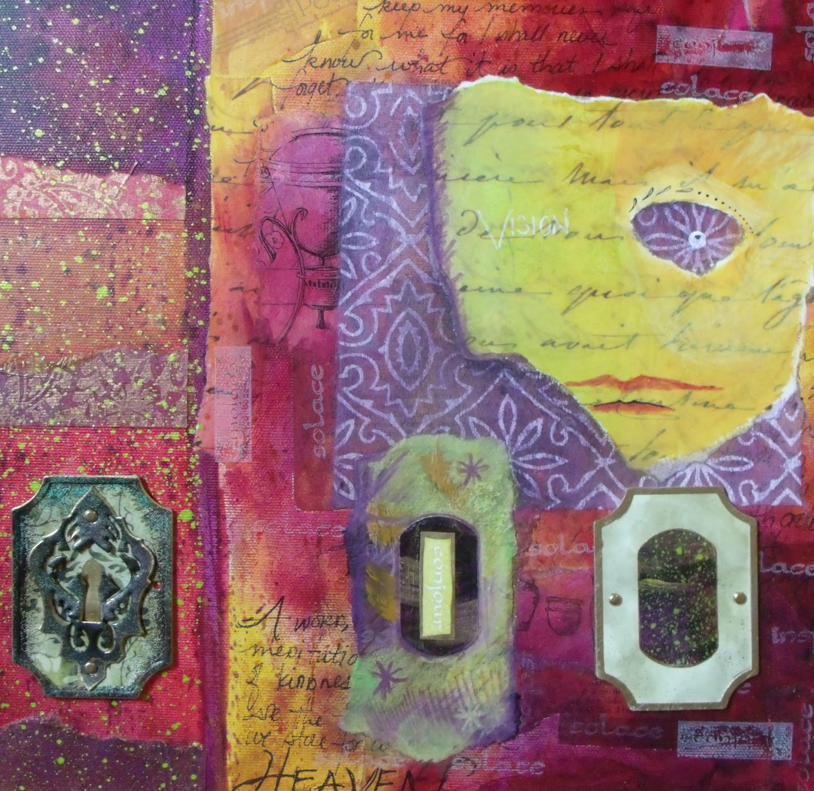
The vault is open........


The top layers are laid out on the floor. From left: Italian wall
calendar 1998, watercolor exercise from Watercolor Magazine
of pears, 2 Chagalls from a wall calendar, 1992 Gates McFadden
portrait in colored pencil, Dover Collection Degas wrapping
 paper, college project "Product Announcement" 2001, watercolor
of a random hill in the middle of a farm in Port Oneida in
Leelanau County in the Fall.
 
Charcoal drawing from Glee Fenby's class 2000.
Study in textures and shadows.

Prelims for rubber stamps sold to A1 Stamps. The collection
celebrates my home town.
Trying to be Degas with ink.... not sure how
successful I feel about this one.


Left: Censer for Christmas maybe 1999? Right: Imagining a Woodcut or Lino-cut badge
of an artist in the service of his or her queen.
Grammpa Gerbstadt and the unfinished portrait
1998 or 99


THe NatGeo cover that started a thing with cacao pods sitting
alongside a watercolor exemplar of the Hebrew alphabet.
Practicing a new wet in wet watercolor technique on the left
and exploring cacao on the right.

One of many partially used watercolor pads in the box. I opened
this one thinking it would be the fifth empty book. But no. This
one had a surprise inside......
A mostly finished stargazer lily.


Visitors Count