It's a thing. It is officially a thing... the crafting of a meme, to put words to pictures that might or might not belong together that may or may not get a laugh but is always intended as an homage to a person, place, thing, concept. Grumpy Cat, a.k.a Tardar is the number one meme on the webs. I can not begin to guess who comes second. Who's on first, What's on second. And cue the Doctor's music......
Ear worms used to be comedy sketches as well as music (like the afore-referenced "Who's on First" routine from Abbott & Costello (see "Before our Time" in your parents book of things kids don't understand) That is not a real thing but should be. It used to be if someone was whistling the Andy Griffith theme, you'd catch a snippet and that would make your brain playback the opening credits in your head. You had it to yourself and then that would release a flood of memories from the show. And it happened with any show tune that someone came up with. You had some happy little memories dancing in your head. These days rather than just let the accompanying imagery from an audio memory trigger dance around in our heads, we clip, cut & paste, disassemble and reassemble then photo edit those snippets and post them on the web.
I thought you could only do this with photoshop. And then web pages started hosting editing functions. It is like having your own little Scrapbook fest. Except there aren't 30 women gathered around talking about layouts and inspiring each other. It is you and the music of choice and the only inspiration comes from the other memes you've seen floating around. And I got to thinking, after seeing some very good Sherlock memes lately...
Are memes art? Are they craft?
Some, undoubtedly, are literary to be certain. The word play, more than pun and as sophisticated in logic & humor as a Calvin & Hobbes comic strip qualify as word art. But is it graphic art? Not always. Not unless you are talking about the "Keep______ &"... meme. It has a very strict graphic layout and set up for it's execution. Oh... and that would be meme #2. My personal favorite is the new firefly Keep________& meme. So while literary because it is composed almost entirely of words it is graphic because the words are the thing.
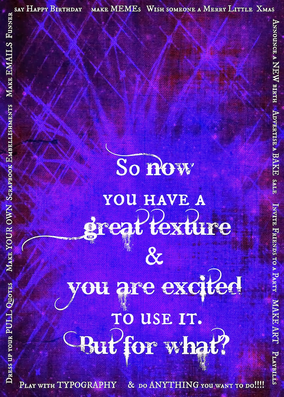
To be sure, I have seen a lot of things that are just slapped together. And then some that are just breath-takingly composed and executed. So I thought I would give it a go using picmonkey. And this is what I came up with:
 |
obviously the photo credits belong to the original photographer and the
graphics belong to Picmonkey. My only contribution is the composition
& the wit. |
About choices: the memes I like best have photos that reflect the idea of the chosen text. Since it is a question and the question follows a basic "if/then" statement with references to time elapsing I wanted a picture that was "current" as I already had the Edwardian era picture as an end goal. And let's face it, this is my favorite look on him. The expression seems to say: "How thick are you?" or, my most hoped for interpretation of the top photo, we think that Richard has asked a rhetorical question and is waiting for the answer to sink in.
The second photo reflects deep concentration. That rhetorical question is being considered and answered and about 30 nanoseconds after the shutter clicks a mental "D'oh" will register. My hope with this composition is that the elements all blend to lead the viewer through the same thought process I had in trying to answer the question for myself.
The whole thing reminds me of the format that we used to use to make hand stamped cards back in the day. Which is essentially how my scrapbooking style developed. It is similar to ad layouts I've seen recently. And there is not too much to think about. Picmonkey did all the math, and suffered the headaches of trying to figure out what the optimal layout options should be. You just chose based on the number of photos you are working with.
The color scheme is analogous because I wanted something elegant that did not distract from answering the circular question or from such well crafted stills. Not to mention that the focus is more on Richard Armitage than on the humor. Though both were essential in cheering my friend up.
And yes. It did cheer my friend up. It has been submitted to an RA fan site. And I am hoping they will share it with the world. If not.... I share with a handful of my friends around the world and hope some RA fans will find it and enjoy.
And....... I just remembered I have some thoughts in draft that I wanted to share for his birthday last month. Don't feel bad RA, most of my friends didn't get theirs this year either.