Thursday, November 1, 2012

Preliminary

or drafting is not my thing.
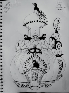
from the skethcbook
I love architecture of all kinds especially Baroque and the more organic work of my current muse Antoni Guadi. Rocco had its place. Traditional Greek design and the gothic megaworks of Europe boggle my mind. The scope of those projects....

And then I remember all the math and drawing involved before a sculptor ever gets a chisel to marble or an iron smith gets to crafting the mould. And it is the drawing that gets me every time. Rather the draftwork involved.

There are special considerations for vertices and arches. How do you support a dome without taking up all the interior space? How do you make a straight line intersect with a curves and not have the building fall down.

I am, perhaps, being too hard on myself since these things are never going to be real buildings that anyone could walk into. Nor are they going to be "real" buildings to the wee creatures I imagine would carve their own Halloween house with tooth and nail. And that really is where the idea for these came from. Imagining a pumpkin field as a city for mice, shrews and the other things we don't want living in our houses. They are fantasy.

And I think that my type A persona should leave well enough alone. Except that I can see my iron peacock over the front door is off center. And the peacock vane on top isn't really sitting on the ball for the domw too well. A cat goes stomping through that neighborhood and there goes the weather vane!  I've already started editing this on paper. As with the last one; a photograph gets you some good distance so you can evaluate how solid your drawing is.

It is essential to do this no matter what you are working on. But in this instance, because I may turn these into rubber stamps, it is more important than color. My fingers are so twitchy to get a brush in hand that I feel I really want to skip over the edits and improvements. If I do that it won't really be my best work. And that will make me feel worse than the compulsion to get the drafting right and the frustration that I am not as much a draftsman as a person who appreciates fine lines.

Tuesday, October 30, 2012

Edits

wash of Hookers Green over the original gourd color
 
There was something that bothered me about the nearly completed painting. It is the same problem that I had with the first house. Not enough black. And, while inspired by the work of Antoni Guadi, I had rather missed something in my work that I appreciate in his.


India ink detail above the green base
Chiefly, I did not have my spaces broken up quite enough. And the undulating lines of his work were missing in mine.When I washed the Hooker's Green over the gourd and gave it some flowing lines I realized the that eaves were what were missing in my gourd. I also realized that the stained glass transom over the entry was just hanging out. It wasn't really tied into the design for the entire entry in any sensible way, though it is tied to the entire aesthetic by virtue of its motif. So bring out the India ink. AGAIN!
And what I like about how this turned out is that it now more closely resembles the spiny ornamental gourds you see out for the holidays. I also enjoy the fact that the lines are more serpentine and less abrupt than my hand usually draws. Not sure if that is fatigue in my hands or just the nature of being heavy handed with the pencil. Though... now that I am blogging and only looking at the picture on the right instead of the whole thing I see that the spires in the valley are not as smoothly transitioned as I would like. And I could join the eaves to the doorframe...

You'll also notice that at this stage I have removed all of the masking fluid and the formerly white spots now have an eerie green appearance. Later in this session the top of the gourd got a good dose of Indian Yellow that really makes everything pop. And that sloppy swash of green is now fully integrated. I have an idea of how this is all going to work out so that I have a great holiday ornament for a desk or childs dresser that uses my rubber stamping techiniques.

cut from the background with more details added though that
bat on the door is still giving me fits of pique. I may have
the problem solved, but it is going to require some trickery.

 
Once I have the mechanics worked out I should have a marketable item. The first one is going to Jesse with another for her to auction at her kids' school fundraiser this year. The third one is going to go to etsy. We'll see how that goes before I get crazy about building these things enmasse. Of course, with the way the Internet works and the fact that we "live in the future" I can always build on demand and not worry about the overhead of stocking product. So now that I have some of the bugs worked out of this one I feel a bit more confident about that Venetian Peacock house.

A bit. 

Sunday, October 28, 2012

Gourdian Architecture

Well, I think I've done it. I've ignited a new obsession. Another house design on a venetian theme is in the works. And they are getting really complicated. I am  going to have some trouble keeping them  small and workable. I am also having issues keeping them from looking too contrived. The first house went together easier, I think, because I was working... oh pardon the pun, organically. Now I am trying to achieve a look.

The Venetian house uses a type of venetian blown glass lamp called a "corset" lamp, masks in the tradition of Casa Batllo and peacocks. The trick to this is going to be keeping from looking like a trunk of mardi gras trinkets fell out on the sidewalk. Oh and to keep everything level.

I seem to have developed a lean. But here in a few days I am going to have to quit with the paints and switch to a keyboard for NaNoWriMo. I hope to finish this year.

Wish me luck,

Visitors Count