Tuesday, March 18, 2014

And something to do while the paint dries....

I started another project to work on while the paint on the poppies is drying.

I really like the composition in this one and the fact that I offset it this way on purpose. I had an initial vision that the more I look at this, the more I don't like the original plan. When I laid this down in the sun to take a picture I got the shadows of the trees outside cast on it. And I like the directionality to the shadows. Originally I had planned to work on something more nebulous.

I had also planned to keep a lot more white here in the top of the bulb. However, the paper that I am working with, Canson 140#, soaks up water faster than I thought it would and the Aureolin yellow that went down for the first wash had much sharper edges than I meant. My bottom yellow faded up into the Aureolin like I wanted it to so there was a bonus. I think that was a regular cad yellow in my Cottman travel pack. Now the vermillion and other red washes are a hodge-podge of whatever looked good in the incandescent light while I watched the umpteen millionth episode of Poirot for the night so I don't even know what I did to get those colors. I only know that I will leave them alone.

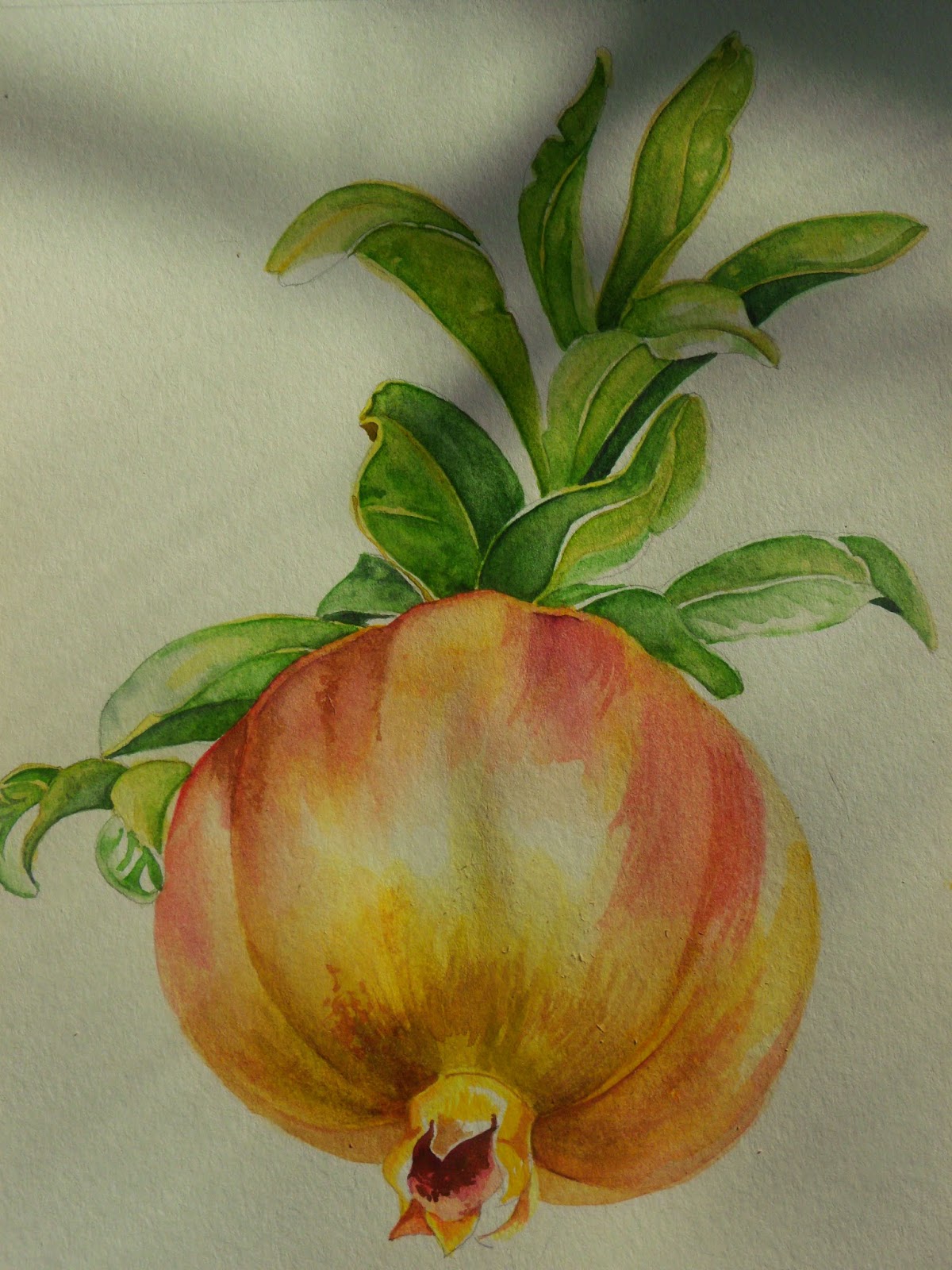
Green Gold and Sap green were the mid range tones over Aureolin on the leaves. The darkest greens are Green Gold and Antwerp Blue. I left all the hard edges to dry overnight and stain the paper well. The Antwerp lifts better than the green gold so today when I smoothed everything over I got some really nice results in the leaves.... it actually looks like I know what I am doing.


So far my favorite part is the potato chip curl in the leaves on the left and the one strong leaf curled to the right above the fruit. Now that I have smoothed everything over again, I need to go in with another layer of mid range green, maybe with a little viridian to make some of the olive leaves a bit bluer a green, deepen the separation between leaf sets and hit a few details with some very thin lines. While the fruit is spot on from the photo... at least it doesn't need more touching up, I still think that my favorite part of this will be the leaves.


What do you think, purple grey for the background? Or purple green-grey?


with a background

 
Here it is with the first layers of background color. I wanted to contrast with the poppy pods and went with orange-pink ( a mix of Holbein's Opera and Green Gold from Windsor Newton) but the yellows and greens in the iron patina washed out.

At least with the obnoxious amounts of poppies the wash pushed them into the background a bit so that I could pick out just a few to high light with details.

Then the problem becomes the poppy fading into the background. I am debating the addition of some lavender tones to the bottom of the background around the poppy petals. I know green won't work and I don't want to do brown either because I want to keep it bright.

The bottom of the poppy, where all the goodies show through the paper thin leaves could be made a bit purple near the stem and then that color could come up to background and fade up..... I don't know. I am a bit stuck here to be honest.

But it gives my brain something to do when I get overwhelmed with moving again. Or with the idea of finding a second job. Interview's today.

And the plumber keeps setting off the fire alarm with his torch. You'd think he would take the batteries out of the thing.


Monday, March 17, 2014

Watercolor project: first phases


First phase of watercolor with a piece of ironworks from the old state hospital gates and some poppy pods; I'm not sure that I should have continued much past this point. I like the lightness of the pods and the mere suggestion of their presence compared to the in your face look I have looking at phase two.
 
However in phase two the iron works do stand out much better and some of the poppy pods faded into the background to keep the foreground from being too busy. And I do see that the frame is off, it needs to be extended to the curve of the poppy tendril at the bottom. And I need to deepen the shadows on the frame. I may have to do some fancy fret work along one of the sides.


Visitors Count